
Design Museum of Chicago
Website Redesign for the client in 5 days

I own
Teammates
Deliverables
Timeline
Heuristic Evaluation
Competitive Analysis
Google Analytics
Wireframing
Hi-fi prototype
Alexis Ashby
Me
All-in-one Figma file
Mar 2019 - Mar 2019
Before We Get into Detail
This is a one week project during my spring break. Our client, the Design Museum of Chicago is a non-profit In a team of two, we evaluated and redesigned the website for the Design Museum of Chicago.
Here's a brief overview of what we did each day:
Day 1:
Went through each page and evaluated its user experience
Day 2:
Dived into Google Analytics. Categorized findings.
Day 3:
Presented and validated our findings with the client. Based on our recommendation, worked on wireframes.
Day 4:
Continued working on wireframes. Worked on new web mid-fi prototypes.
Day 5:
Finished mid-fi prototype and the home page hi-fi prototype. Presented to the client.
Challenge
Since the project is fairly short, we need to define the scope well and maximize our deliverables. By the end of the week, we would give our client a clear actionable to-do document that they can continue developing with.
Our initial plan is to use the first half of the week to do the heuristic evaluation and check Google Analytics. After research, presente our findings to the client. Based on the feedback from the client, we do lo-fi prototype and hopefully hi-fi prototype. Given such a timeline, we try to dive as deep as possible on each step but also finish the work within the "deadline".
Full details of the deliverable is in this Figma file.

Old wireframe
New mid-fi wireframe
New home page hi-fi prototype
Style guide and actionable items

Heuristic Evaluation
In the first day, we went through each page on the website to evaluate its usability.
There're several criteria we are looking at:
1. If the website highlighted useful information to its target audience and users can get it most efficiently
2. If the navigation on the website make sense to users
3. If the website prompted Design Museum of Chicago
4. If the website helped the museum to get more donation
After the evaluation, we found that many problems on multiple pages fall under the same category. In order to better deliver our findings and be able to systematically work on prototypes later, we categorized our findings.
In terms of information hierarchy
Problem 1.
Pages in different hierarchies show similar information. For example, home page, exhibition page, exhibition detail page all look the same. We should prioritize what information to show at each page. Distinguish each page so that users are aware that they are on different pages.


Old
Home page wireframe
Exhibition page wireframe
Exhibition detail page wireframe
New
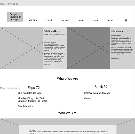
Put Exhibition and Event at the same important place as Google Analytics shows they are the top two most visited pages.
New home page wireframe

New
New Exhibition page and Exhibition detail page wireframe
Problem 2.
Within a block of content, it’s hard to distinguish different messages since they all have the same typeface. For example, open hours at different locations and Publication/Press/News for the current exhibition are mashed in the same section on the edge.

Old

Location and hours on Home page

New
Location and hours on Footer
In terms of styling
Problem 1.
Poor readability on navigation. Sometimes content will overlap with each other.
Problem 2.
Unnecessary use of hover-over effect on ALL images. Some images are better to show in colors such as shop product and donor’s logo image.


Page banner before hover-over
Page banner when hover-over

Shop product list page

Shop product detail page
Problem 3.
Lack of consistent formatting. Eg: On Exhibition and About page, museum location and hours are at different places.
Problem 4.
Some link should be call to actions. Eg: “Join today” at Membership page
In terms of link format
Problem 1.
Links which look the same serves behaves differently, which messed up users mental model. Links in the same format can either present new content (exhibitions page), refresh Current Page (membership page) or redundant (about page features). “Join membership” link leads users directly to the shopping cart. Add to Cart opens shopping cart each time instead of adding each additional item
Problem 2.
The format of links which serve the same purpose varies. Sometimes underlines, arrows, or both (membership page). While format of links which serve the different purpose is the same. In shop product list page, buttons of add to cart, select options, and threadless are the same.


Examples of bad links on current website
In terms of content presentation
1. A huge amount of information presented on the webpage which doesn't entice users to click. Eg. a list of 162 events on the Event page.
2. The Information on the Support and Membership page didn't attract users to donate or pay for the membership. Users can't know what they can get from the membership easily. Support Page has many donation options which can be overwhelming. We suggest highlighting the social impact of donations and membership benefits.
3. The current website doesn't communicate well to audience that what they can get from the museum. Eg. The museum offers rental to hold events. But the images of the space didn't show its full capability (Rental page). We suggest showing its space from different angles so that people can have a better understanding. On the Membership page, it's hard to find that membership gives you access to exclusive workshops and events and students have a discount buying it.
4. Banner images emphasized the wrong message and gave the audience a false impression. Eg. when there's no events, the banner image on event page emphasizes "no workshop available right now". On the Rental page, the banner shows an event after all audience left, which conveys a negative "unpopular event" information to the audience.


Event page when there's no event
Rental page banner image
Google Analytics
1. Most Viewed pages all time: Home, About, Exhibitions, & Events.
Surprisingly, the About page is one of the most viewed pages. But the engagement with the About page appears to stay on the surface. It has a low bounce rate which is good indicating that users are navigating from About to other pages. However, there's not much interaction with the content on About page.
2. Income-driven web pages (Shop, Support, Membership) are higher in viewership than cart, which means users do not purchase items that they view or select.
3. A design competition page has high viewership. We asked client later that if they did anything that makes this competition so popular or most competitions got many views. Client said that they distribute this page via different channels which explained the high viewships.
Takeaways: the effort on promoting events via different channels helps a lot. They should continue doing that if they have any want to promote in the future.
Final Deliverables
I want to highlight two deliverables we did as these are where we put most thoughts of
- Support/Membership page and high fidelity Home page.
Redesign support page
Problems on the old site:
To get users to support and donate money, there are two webpages -- Membership and Support. After confirming with client, these two pages are essentially serving the same purpose and could be combined to one, which is what we initially proposed. Fewer options on the navigation, the better since users would spend the less time to decide which one to choose.
We identified some problems on these two pages.
On the Membership page
Benefits of buying the membership is not well emphasized. We suggest emphasizing on what users can get from the membership.
On the Support page
It didn't do a good job persuasive why people would donate and there're too many donation options on the page which would deter people from donating. We suggested highlighting the impact of donation so that users feel good about contributing to society, and getting rid of so many donation options but creating a donation button with a slide-to-fill icon as a metaphor that your donation is fulfilling the design.


Old

New
Hi-fi sample of Home page

1. Changed the background to white to make the content more silent and easier to make with the color.
2. Differentiate the Home page wireframe from the rest of the pages.
3. Put the promoted (on-going or most recent) exhibition and event at the equally important place since exhibition and event page are the most viewed pages all the time.
4. Clearly present the location & hours information.
5. "Who We Are", new section, since About page is one of the highly viewed page. It's also required by the client as they want the home page to show their identity.
6. Encourage people to support after knowing "who we are".
7. Big call to action for subscription since distributing information via different channels did help the promoted event get more views.

8. Consistent horizontal footer and header to allow more space for the content in the middle.
Style guide docs


Reflection
I'm so glad I did this project using my Spring Break. Two big things I learned from this project: analyze and draw the conclusion from Google Analytics, and get things done within a short time period. The final deliverable we have is definitely not perfect but it's a great guide for our client to continue developing. Moreover, what we suggest is more than a web redesign. We also have many solid suggestions on branding from a business perspective.